
toucanBox
Mixing digital and physical play
I explored whether adding digital value to the physical craft box can lift activation rate at a critical point in the first box experience.
Responsive web app
- Stakeholders in:
- Marketing
- Operations
- Technology
- Project lead
- UI/UX Designer
- Front-end Developer
2016
Responsive web app
2016
- Stakeholders in:
- Marketing
- Operations
- Technology
- Project lead
- UI/UX Designer
- Front-end Developer
A toucanBox subscription craft box contains all the materials needed to complete a craft project, with illustrated instructions, stickers to collect and an activity magazine.
In my hybrid role as digital product designer and R&D manager, I was given a broad remit to tackle projects across the customer journey. I set strict criteria - setting up a Project Passport to ensure we were focussed on key metrics.
This project - Create by toucanBox - introduced digital/physical play activities for children. The aim was to change parents perception of the product and move the needle of customer activation - the rate at which trialists convert to fully paying subscribers. We knew the top two reasons for cancellation in trial were affordability and value for money. My hypothesis was that exclusive digital content could help address this, without increasing the variable cost of the box.
Section 1 of 3
Discovery
# Research
I asked existing toucanBox customers what value for money means to them and collected their attitudes to children's digital media.
While engaging parents with an in-depth interview, I simultaneously offered their children a selection of apps to play on an iPhone. We later switched focus to the child, discussed what they were doing and asked them questions. In this way I fleshed out my existing data insights with qualitative information and play tested competitor apps.
The box often didn’t seem like good value for money
Even satisfied customers felt the product was somewhat overpriced. They focussed on the value of the materials, rather than the holistic experience.
The duration of the toucanBox experience could feel short
Some customers would craft with their children, others would use the box to get a moment of peace. In both cases they wanted a longer lasting experience.
What would be distinctive about digital content by toucanBox?
toucanBox customers want to offer their children hands-on play away from the screen. So any digital content could not be a screen-only experience.
Top apps and search queries suggested areas of focus
Creative, Learning, Exploration, Rhythm, Roleplay, Nurture and Story were the top categories in app stores and web search.
Device access and ability lifts at the upper range of our age group
A survey of parents in Germany (2016, The Kids Want Mobile) found that device access, frequency, session duration and child ability increase rapidly from age 6.
Digital toys for young children have specific characteristics
Based on competitor research I could see that apps and games targeting our age group are not typically competitive. They offer open-ended play.
# User journey and ideation
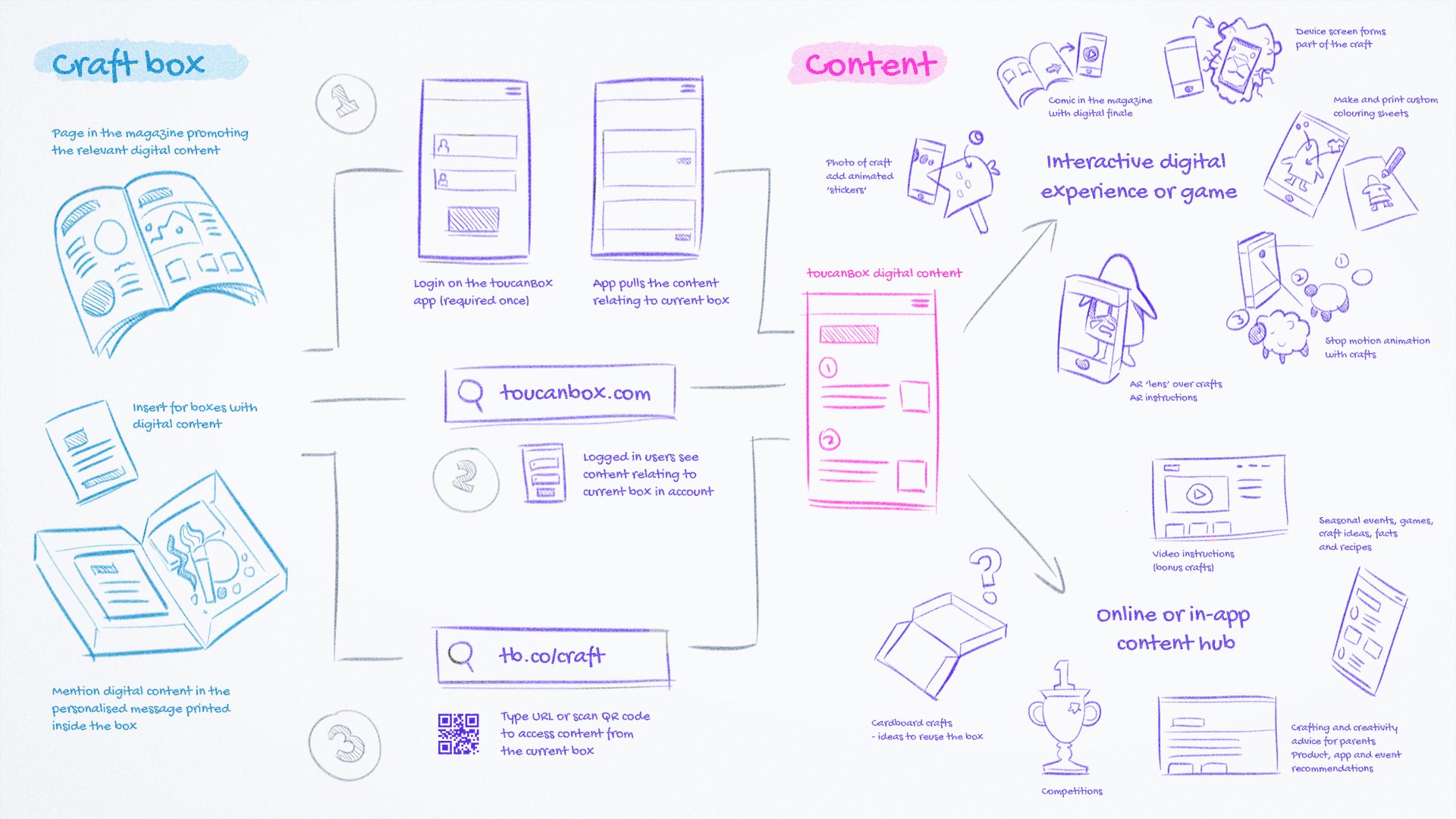
What ways can customers access our digital content? I foresaw three possible routes; dedicated toucanBox native app, online accounts or URL/QR code printed in the box. There was a balance to be struck between the friction when reaching the content and the effort required to build the delivery medium. For a pilot, it was hard to justify building a native app or adding the business logic necessary for content to automatically appear in customers' accounts, making printed URLs the natural choice.
I facilitated a company-wide brainstorm for content ideas. They broadly split into two themes Interactive activity and Content hub. We agreed to spin out the second concept, into what later became toucanBox Activities Hub (with a focus on SEO and customer acquisition).
# Magazine
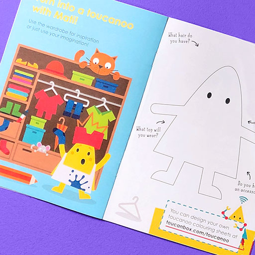
The magazine in the first box features a double page spread introducing Create by toucanBox.
# Testing prototypes
I was able to test at toucanBox's regular craft testing sessions with parents and children.
# Augmented reality (AR) on/in craft
Add 3D animated characters, enhancements and storytelling to a child’s finished craft project.
- Children found the concept very compelling
- They used AR in unforeseen, creative ways: "Look I've got wings on my arm"
- No support for AR in web browsers (2016)
# Extended storytelling
A comic in the magazine, with an interactive finale. Each craft is a new chapter in a digital adventure.
- This prototype excited children the least
- The interruption in the story broke the children's attention
# Make a Toucanoo of you!
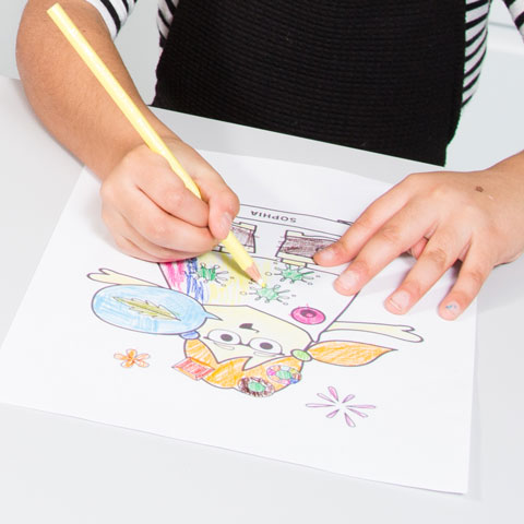
Then print it out and colour it in. Toucanoos are cute triangular characters which feature in the toucanBox activity magazine.
- Engrossed children for up to 45 minutes
- Digital / physical crossover experience
- Not linked to the box theme
# Detailing a candidate
My next steps were to refine the Toucanoo colouring sheet prototype by taking action on test feedback and improving the visual design.
| Observation | Remedy |
|---|---|
| "My Toucanoo is called Wendy" Many children named their Toucanoos, even if they werent able to write the names | I added a text box in the print modal where an older child or parent could type the name, which appears on the printout |
| "Theres no skirt!" Several important accessories were clearly missing | I added skirts, wellington boots and several other accessories |
| "I dont want this one" Children wanted to be able to delete accessories | I observed children dragging items off the screen, attempting to delete them, so made that actually work |
| Certain types of accessory like hats, clothes and shoes quickly cluttered the screen and didnt make sense out of their intended positions | I made new placements in specific categories (e.g. hair) remove the previous accessory of that type. This proved to be an intuitive limitation |
| Parents found it hard to get printing to work. It depended a great deal on the device, configuration and their technical aptitude | I added the possibility of saving directly as a PDF and a printing FAQ page |
| Many adult testers requested that hand-held items move when the hand moves | This proved tricky to implement in the existing system, so I decided not to include it for the pilot |
Low-fi prototype of the Toucanoo colouring sheet maker, used in early testing
Section 2 of 3
Delivery
# Visual design
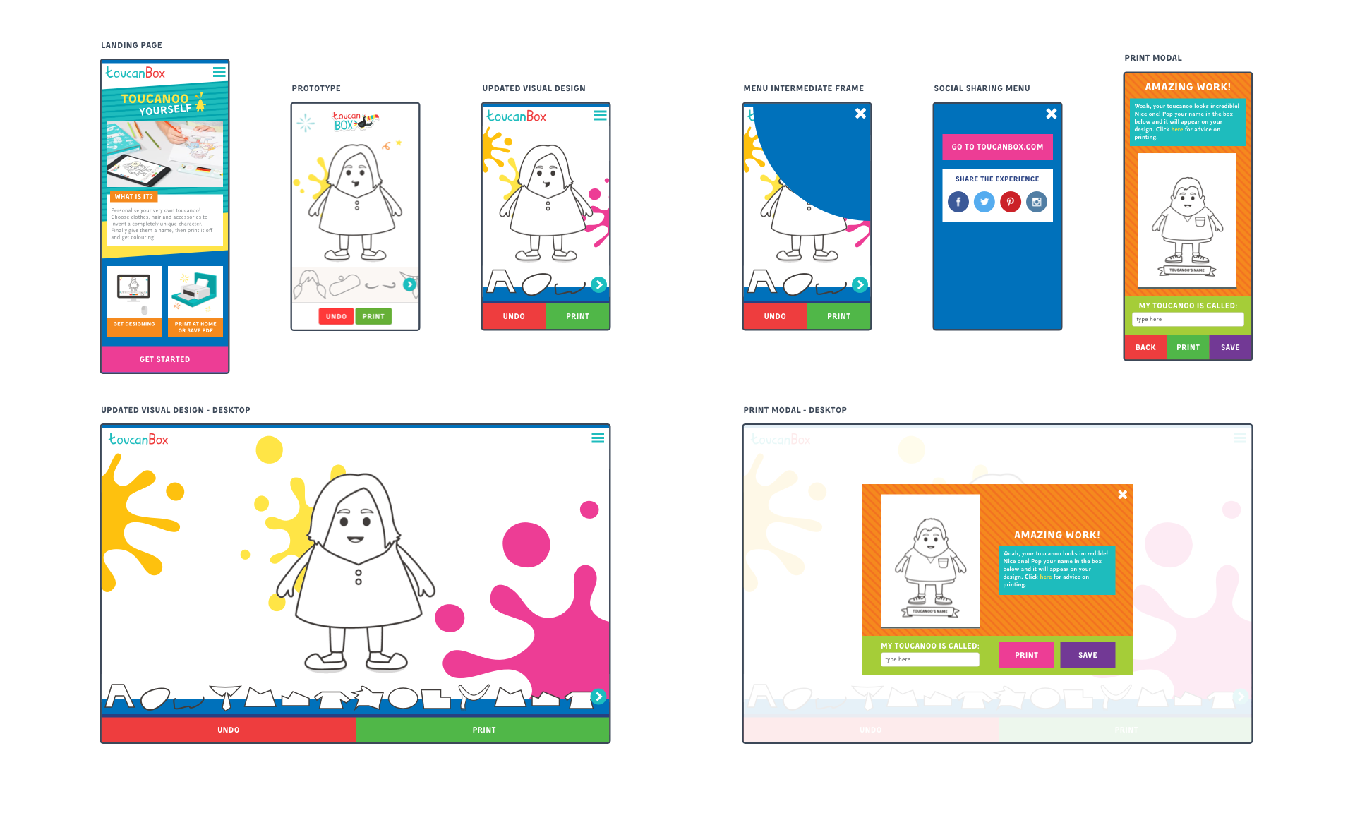
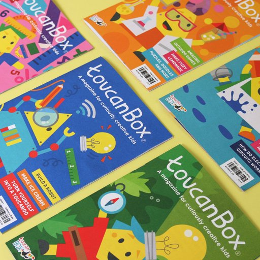
In early 2018 the Creative Team updated the look and feel of the activity magazine. In order to maximise consistency in the journey from magazine to web content, I chose to update the visual style of the experience. It also acted as a preview of how the new look might translate into UI across the website.
# Development
I selected WebGL Canvas rather than DOM or SVG. My rationale was performance on low-spec mobile devices, which could lean on their graphics processor (GPU) to keep frame-rate high and animations smooth.
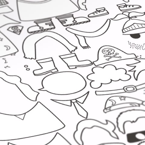
Dozens of Toucanoo accessories packed on a compressed PNG sprite sheet
Tuning tweens and sinusoidal motion sometimes produced unexpected results
Techstack
Framework
Jekyll
Localisation
Jekyll language plugin
Renderer
Pixi.js
Build
Browserify, Gulp
Section 3 of 3
Evaluation
"When I try to imagine what kind of app or game toucanBox would make, this feels exactly right."
Sara Barokas, toucanBox CPO and co-founder
# What went well
The pilot launched in the first box magazine for all trialists, you can try the live app (opens new window). Those customers that accessed the experience were very engaged. There was internal enthusiasm about the initiative and a general feeling it embodied our values.
# Lessons Learnt
I measured no noticeable change in activation rate due to low reach. When I followed up with customers, I discovered the cause was a combination of friction reaching the content and a mental model that didn't expect it. Only once they understood what it was were they interested. I realised it would require considerable effort to educate our customers at scale, with an uncertain outcome.
# Going forward
Was there a future for digital interactive experiences as part of the toucanBox value proposition? Perhaps, buit not in the short-term. The pilot proved that departing from the core value proposition could have potential, but that resources would probably be better spent focussing on what was already working. My next initiatives focussed on optimising customer onboarding, addressing known pain points and enhancing the subscription experience.
higher average time on page
minutes longest session
of trialists accessed the experience