toucanBox
Increasing satisfaction with personalisation
I spearheaded a strategic design project to identify new ways of improving customer retention.

Web application (accounts)
- Front-end developer
- Marketing manager
- UX/UI Designer
- Project Manager
2017-2018
Web application (accounts)
2017-2018
- Front-end developer
- Marketing manager
- UX/UI Designer
- Project Manager
The best products elevate a commodity (like music or holidays, or crafts in this case) into a valuable holistic experience. After completing a user-centred design process focussing on customer onboarding, I had both a pool of insights and the momentum of a company-wide shift to a 'product mindset'.
iterative design, prototype, test cycles can systematically answer intractable business challenges and customer retention was the next such challenge. How might we make customers so satisfied with toucanBox that they want to stay subscribed for longer? Referring back to the research I conducted to generate toucanBox's , we had a clear answer: Get the right craft box to the right customer in the right quantity. With a bespoke technology platform and a direct relationship with customers, toucanBox was uniquely positioned to leverage a personalised experience.
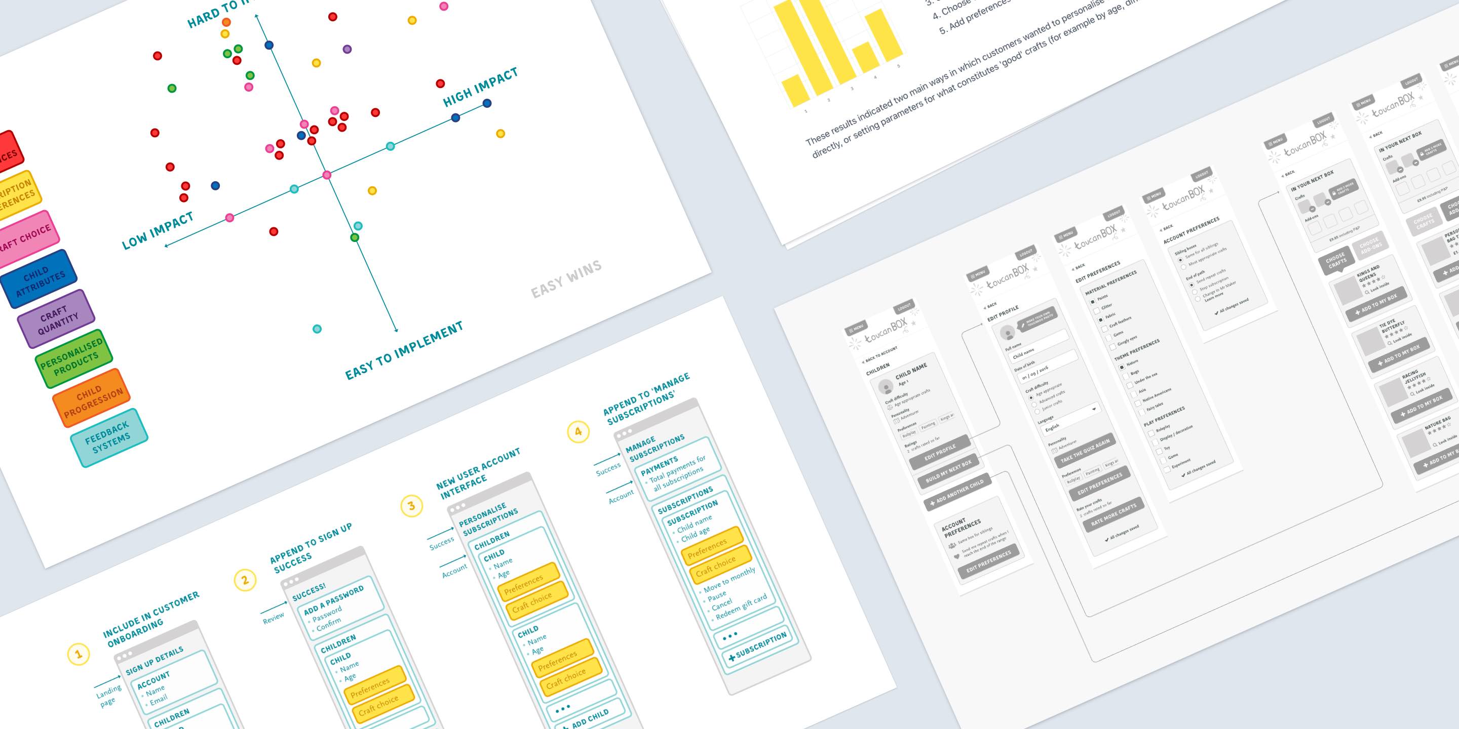
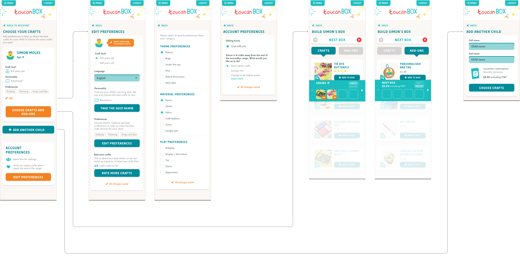
I created several prototypes, including a past box rating system, child personality quiz and child preferences survey. The most promising concept was called the Box builder which showed high engagement in a limited traffic live-data test. Sadly I moved to Berlin before the impact on retention could be fully felt, but today the box builder is live as part of the signup flow and in users' accounts.


# Reflections
Finding the right personalised experience for toucanBox users proved to be the core challenge. By gathering qualitative data from user testing and quantitative data from live-data prototypes (released to a small segment of traffic), two strong themes emerged. Customers either wanted to directly choose their next box(es) or they hardly wanted to be involved in personalising their experience at all.
"I wouldn't add my preferences if I can choose my box. It's basically the same thing, except choosing is better."
"I simply don't have time for that [level of engagement]. I like toucanBox because I trust what you send is good for my kids."
I believe this dichotomy reflects people's broader expectations of digital technology "Either I'm in total control, or I expect the algorithm to anticipate my needs". We knew we needed to tackle both these opportunities, for both types of user. Ultimately toucanBox customers should be able to choose their boxes months ahead (adding additional materials, books and other add-ons if desired) and provide as much or as little information about their child as they want, always getting the best possible box. The Box Builder focusses on choice but I imagined it as part of a broader interface that also includes preferences and settings.

I created a realistic prototype of the Box Builder interface for in-house value and usability testing.